The Weasel Stone: Home of my Warhammer Beastmen Army

Folloow my journey as I begin a Beastmen 8th Edition Army

Tuesday, April 19, 2011

Bestigor completion

I did some shading, a little bit of blending, some more dry brushing and then really worked hard on the champion.

On his right wrist I did some nice work*. I particularly like the black line deep in it. I also worked hard on his various medallions, trying to get them to stand out and be clear from the background.

The real irony in this is nobody but me will ever notice these details. This will not turn out to be a show army, it will look little or no better on the tabletop than any other army I have ever done, and arguably look worse than the oil based armies I have done in the past.

But I will know how much effort I put into the detail. Weirdly, the harder I work on them, the more it matters.


So there is the unit, painted and based, waiting for clear coating. For a while I kept tweaking them until suddenly I thought, hey...there comes a point when you need to just...stop...painting.


Here they are after the clear-coat. And I am happy. They have different shadings. This is something new for me. Always before I tried to get my armies to look uniform. Same skin tones. Same eye color. Uniforms identical. I am deliberately not doing that with the Beastmen.

It started with the Albino champion. It has been developing with each succeeding unit. They are similar...not identical.

I also toyed a bit with how to get them to align so both rows mattered. I think they look "right" as a unit. They are not rigidly lined up in lock step but slightly off center from each other representing the undisciplined Beastmen troops.


I am happy. I think with this unit I did some very nice work.


* When I speak of nice, good, etc. I am meaning in relation to my own painting skills, not those of people who actually do NICE work.

Monday, April 18, 2011

Bestigors continued

 So I did a lot with washes and dry brushes. Part of the problem is I must not wait long enough on the dry brushes...or else my washes are too wet. Case in point: Check out the second model from the left. His right leg (on the left as you look at it) seems to have lost a lot of surface paint. Furthermore, I had a hard time darkening it.


Once more I went ivory on the horns, did a black wash, then dry brushed the ivory again. I think I would like them slightly "brighter" but overall I think it gives them a nice, nuanced look.

I also like the wash on the armor and cloth hoods, particularly on the left two models in the front rank.

Sadly, after this I really got bad about taking pictures. A lot of times the coats were so subtle I could not tell the difference...which is actually what I am supposed to be doing on purpose. So yeah. I guess it works.

Tuesday, April 12, 2011

Bestigor color swatch

Funny thing is, the above models are apparently already beyond "tabletop standard". They have four colors; base brown, black, red, silver and green.

Thing is...I am just getting started. I am nowhere near happy with how they look either up close, nor from eye-level distance when painting them.

A quick wash to darken them and they look a bit better.

I also note the white does a poor job of covering over the silver. I actually have a couple shades of white, so I might just try to pick that up on a dry-brush type thing to provide some shading. We will see.

I like how they are coming along. The biggest problem I have is with "just" 10 models, they paint up so quickly I am tempted to immediately start the next color instead of letting that one dry.

Batches of 15 - 16 models seem to be about the right size to paint in one go, but that does not really work since my units are typically in increments of five.

This, of course, might point to an issue with my list building. There is little reason to use 5 except it being a prime number and me liking that for a multiple.

We will see if I change my mindset as the project proceeds and I start playing the list a bit more often.

Monday, April 11, 2011

Bestigors Work

I want to stick with the basic color scheme I have developed. Varying shades of browns for their fir and skin, red hues for most clothing, a couple dashes of green for color and off we go.

As normal, I plan to make my champion albino. For some inexplicable reason I did not do this and instead base coated all them in brown.

Having learned from my efforts on the out-of-print Beastmen models (thank you Herdstone for the identification assistance), I elected to put some color on quickly. So next up is a splash of red.

For some bizarre reason my camera stopped flashing, so the pics are not exceptionally good. Actually, they are pretty bad...but they do highlight something I like which is the heavy dose of color the red brings. It really does a nice job in my opinion of meshing with the rather neutral and drab browns.

I am actually starting to like the 'feel" of the look I put together which is very nice since it kind of came about by accident.

I am not big on figuring out exactly what I am going to do on any given model. Generally I just look at it and think, "brown fur, red cloth, white on teeth, etc and dab in silver for weapons and copper on knick-knacks:. Then stuff I did not think about crops up.

Like belts, pouches, hanging tooth-totems, weapon handles, etc. And before I know it I have dripped on...well, I have 25 open bottles of water-based paint. before I started painting the Beastmen I did not even OWN water based paint...so I guess you know how many colors or at least shades of colors I am putting on the models, though in somewhat a haphazard fashion.

Case in point; I am already planning to do a wash/highlight on these figures in multiple shades of both brown and red. I am running I think 5 shades of brown and three of red. 2 of white, Several off-white/yellows.

But I would be better off if I spent a few minutes figuring out what each model SHOULD look like when I am done before I start instead of painting a color, looking at the unit, deciding in almost a random fashion what color to do next and applying it. We will see if I can develop more patience and planning skills.

Saturday, April 9, 2011

Prepping the rest of the initial wave of models

One thing every decent to great painter emphasizes time and again is prep work; scrape the mold lines, prime the model.

Generally dark shades (typically black) are suggested for deeper color models, lighter colors...white...if you prefer brighter colors.

My well-known love for brightly covered models indicates I should use white primer. Unfortunately, in reality I seldom prime at all. I think it is part of my painting catch-22. I am not a good painter so I do not do the things good painters do, and because I do not do the thing good painters do I never will become a good painter.

The exception is metal models. They MUST be primed, even with oil paints. So I had a can of primer laying around. Somewhere during my move they got shuffled in with miscellaneous other items and here I do not really have a good place to indiscriminately spray primer, so I took the models and primer to work one morning.

I am NOT a morning person, seldom at my sharpest in the mornings. It was once said of me by a co-worker after watching me walk into work with my bleary-eyed gaze and not-really-awake carriage, "I am surprised you can even function in the morning, much less find a way to drive to work."

The connection? Priming disaster.

I could not find the black or white primer, so grabbed the gray.

Unfortunately, it did not turn out to be grey. I am not sure how well it shows up in the above picture, so I will show you a close-up of another unit.


Shiny gloss silver. I did not notice this in my early am stupor.

Now, I should probably strip the models. Unfortunately, I primed 3 minotaurs, 10 Bestigors, a chariot, 5 heroes, and 4 harpies.


I decided to go ahead and paint over the silver and see what happens. After all, while I AM trying to do a better paint job on this army than I have done on any other army, I am also doing a lot of experimentation. Maybe it will work out. We will see.

Friday, April 8, 2011

Finishing the second unit.

I have mentioned several times that I am an impatient painter. I would always rather be playing Warhammer or a video game, watching basketball, playing poker, playing the guitar, eating, watching a movie...well, you get the point.

But I have committed to doing as good a job as I can on this army. So even closing in on the end I am trying not to skip steps, just call it good enough and finish, or anything like that.

One of the primary reasons to hate painting with water...besides the oft-cited issues I have with it being dull, having poor coverage, etc...is it is so hard to get decent paints in the colors of gold, silver and copper.

I tried it anyway. And as you can see in the picture above, the results are...well...disappointing. I might try a different brand or something because these colors...they look horrible in the bottle, awful on the palette, and gruesome on the model.

I actually considered using oils for those colors. But I did not.

I then went with my horn base color. I still like the ivory look. So I painted them ivory. then, to create the shadows, I did a heavy black wash. This time, however, I did not thin it enough and forgot the glue. It was the epitome of a blown wash.


Then I should have done several light coats of dry brushed ivory. I did about one and called it good.Time to base them.
Once they are based, all that is left is to do the dip, glue on the magnet and slap them on their base.


I think this unit sort of shows a plateau. I think the Gor I did first were a big step forward in painting with water. These guys, if there is improvement, it is strictly marginal.

The legs I think look better, as does the hair. But the horns needed a couple more coats I think. A few places on the legs did as well. I am not happy with bleeding out of the hair. From the table top they will look fine, but up close...not very good.

I also forgot to do their beard hair.

Their fingers, chest and arm muscles, and leg fir all are improved, however, so I guess I am okay with the overall look.

And with the gloss applied, I am satisfied.

Thursday, April 7, 2011

Continuing unit 2

I am taking fewer photos. Partially that is because I am doing a bit more with dry brushes and washes trying for a look of individuality without blending.

The Dwarf slayer army is known for having orange hair. I thought it would be funny to steal that idea so decided to slap some orange hair on these guys.

 I really like it for several reasons. First, it is yet another counterpoint to the brown earth-tones. Second, it sets of a different part of the models. I now have color high, a block of brown, then another splash of color so it ties the model together and acts more like highlights than color blocks on their own.

Next I wanted to offset their weapon handles a bit. I painted those, then did a pseudo-wash of the light, almost neon greens to deepen them a bit.
I think the look is really coming together. It was time for another bit of red. Again I splashed some on the weapons as if this group has already been fighting with some success.
I made a random decision the champion should be more successful, so I even gave him a bloody fist with a drop on his hoof as if he was dealing out punishment that led to splatters.

I finished with a wash, then a dry brush on their hair to add some reddish tinge to the orange, to break up the uniform look. I think their loin-cloths are starting to show some definition that will not fool anyone into thinking I am a great painter but is definitely superior to past efforts.

Things are coming together. Almost done with this unit.

Wednesday, April 6, 2011

Painting unit 2 proceeds

So with a splash of color applied, I decided to go with a wash. I am still struggling a bit with my wash technique.  I have been unable to get the mix exactly right.

If I were smart, I would go purchase some eye droppers to parcel it out in a pretty exact mix to help experiment with different ratios. Being me, however, I just keep trying combinations that look right to me.

This time I think I did not go heavy enough on the water.

I tried something a lot of people suggest, which is including a small amount of glue in the wash mix to act as sort of a binder. I think it looked better than most of my washes.

I then went back to the dry-brushing, but I think I erred a bit in using a color that was a bit too light. Below you can see the results.

Sure, the upraised fir on the legs stands out. It just looks terrible to me. Almost a grayish look in places.I also did the belts in orange to add a bit of extra color. I figure the orange fits the red touch in the first unit. I am debating even doing the hair in orange.

I notice I am getting a bit sloppy in some places. Some paint has slopped onto the horns. This could be problematic as I really like the ivory base coat, dark brown wash, ivory highlight look. Those patches of taupe could really affect that.

But then I started thinking it could have a really nice effect where it alters the shades on the horns randomly. After all, I want the units to look similar to provide cohesion but not identical. I am not running a bunch of clones here.

Of course, having just one pose for the model alters the perception. But since I do not know what these models are anyway, I might just use them as unit fillers elsewhere. We will see.

Tuesday, April 5, 2011

Unit 2 continued

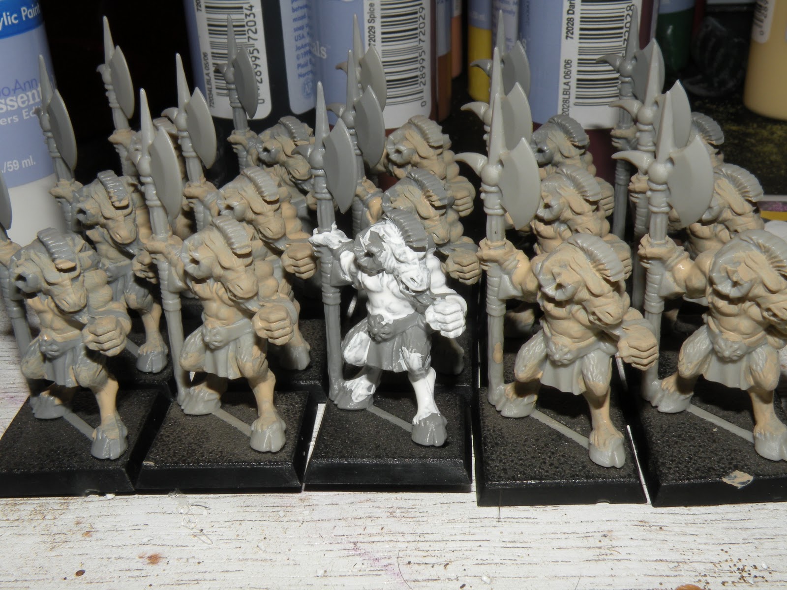
This time, I did not want to paint for quite as long with them looking quite so drab as they did the first time so I jumped ahead and splashed on some red a bit earlier.

The thing is, I really do not like the base coat color. I find it difficult to paint colors I do not like but I need to stay with the process. Adding in color earlier really helps.


If I were to start the Beastmen painting project again, there is a real possibility I would go with a non-traditional color scheme. Maybe various shades of blue for fir and body. That is largely because of the feeling of drabness the models have during the process.

Again, being an impatient painter, it leads to impatience which is one reason this paint scheme is dangerous for me. So adding color will work on several fronts.

First, by adding a bit of color, it helps me like the look more. Second, it gave me a chance to work on their belt totems knowing I can over paint them later if they are poorly done.

Second, it also fits the generally accepted procedure of painting "inside out". That is, starting with the areas that are hardest to reach and working your way out to the outside edges.


 Now that I have some color, I can go ahead and drop the dark leg fir on them. I also tried something new. Once I had the leg and back fur painted, I watered down the mix a great deal more and did an early wash with it.

I am very happy with that choice as it deepens that weak, sickly taupe color. It also is giving some definition to their muscle masses and also addressed a lot of the coverage issues.
Since I went with green on the previous unit, I elected to do some more green with these guys. Again, I think it "brightens" the models a good deal which is important to me. I do not like dull, drab paint.

Funnily enough, I have been doing a lot of reading regarding painting recently and one of my tools to counter-act that is a tool many people look down on. I have already shown my post-dip versions of the Night Goblin archers and the Gor.

I am happy with those paint jobs because the dipping gave them the bright, glossy finish I personally love.

One of the harshest criticisms I heard of dipping is it does not allow a realistic look, partially because of the gloss. In a rather surprising news flash...painting up mythical creatures and races, no matter how well done it is, will never look realistic because the best you can possibly do is bring your own personal vision to plastic or metal life.

It is all well and good to paint shadow lines, blend shades, etc. to get a look you personally desire...but someone else might find it ugly.

I actually did those techniques on one model. I spent a lot of time working on blending instead of dry brushing ( a technique I still struggle with) and found it much easier than dry-brushing...but I did not like the look as much.

I may try it again, but ultimately, I want this army to look good to ME, not to random people I will probably never meet.

Obviously I would like people to think it looks good when I am finished, particularly because I am spending so much extra time and effort on it, but in the final analysis, it is ME they need to appeal to the most.

And dropping on some color, even colors I typically do not like such as green, but that work here, really helps me like the work I am putting forth.

Sunday, April 3, 2011

Starting unit two

 I think I am pretty happy with how my first unit came out. Not top shelf painting by 'Eavy metal or Golden Demon standards, but in my eyes very decent for tabletop standard.

I know my washes, shadings, and drybrushing can use some work but that is kind of the idea of going to water based. To work on those areas.

So for my second unit, I am going with these guys.


I am not real sure what they are. They seem to have halberds, so it is possible they are supposed to be Bestigors. They are pretty old-school. Might even be some defunct unit such as Pestigors. Not sure.

Regardless, the plan is to again go with shades of brown as my base coats, red and green to provide some color, and see what happens.


As is my plan, the champion will be an albino. At this stage I am really liking the coverage I am getting. Counter-intuitively, this probably means I am not thinning the paint enough. The best painters seem to recommend taking several coats to complete a color.

One of my real weaknesses as a painter is I am not patient. I do not want to do multiple coats. I want to do a color once, be done, and finish the task as quickly as possible.

However, I am trying to do a better job on my Beastmen army, so that is something to watch in the future.

Saturday, April 2, 2011

First unit completed

 It is always a little intimidating to me to look at a new unit to paint. I have to come up with a color scheme, come up with motivation, and find the time to paint.

As to process proceeds, however, it gets easier as color starts to bring the model...well, not to life,per se, but to a point where I think it looks pretty good for my talent level. Those words "for my talent level" are pretty key. I will never be a "Golden Demon" level painter. I have neither the patience, inclination, nor steady hand to do that. But what I can do is produce units I like the look of on the field.


Unfortunately, I have never really cared for dull or matte finishes. So I took the shortcut...I dipped them in gloss varnish.
Funny thing is...they look better to the naked eye (to me) than they do in this photo. Still, click on the picture, expand it and enjoy my first completed Beastmen unit.

Friday, April 1, 2011

The end is in sight

 From here on, most of it is washes, dry-brushes, and attempts to fix blown coverage. Part of the issue is this is all an experiment. I am not sure how to work it so when it is done it will look the way I want.
Some of them, like the left-most front row model, have light streaks I do not like. Others, like the right most model in the pic above somehow still have bare plastic showing.
 In the picture above, I had just done the lips using the smallest brush I have purchased. I also touched up things such as the symbol on the belt of the standard bearer. By this time I have done the rivets and so forth, though I still find a few later that do not pass muster.
In the picture above, I finally found a color to do all the miscellaneous wraps, thongs, etc in. It is a lighter green and done to break up the blocky browns a bit more. One thing i should point out. Early on i found a pattern where all the models fit together and have been sticking with it.

The plan is to build two movement trays for them. As they take casualties during the game I will move them from  the tray they are on to a duplicate one. this way I will always have them in the correct order and post-game picking up will essentially be done.

That is a major thing for me since that is part of the hobby I do not care for, the setting up and taking down of fields, units, etc.

For a final bit of color, I used orange for their hair-ties, and on the flag. I also free-hand drew a skull on the banner. No apparent reason...I just thought it "fit" the overall look. Just two steps left.
I spent a great deal of time thinking about how to base them. I considered the black sand/silver rock look of my Warriors of Chaos. I also considered doing black rock with cotton swabs for snow. In fact, even as late as driving home this evening, that was the plan.

It was derailed because traffic was brutal and I did not feel like stopping at the Dollar Tree. So I thought about some combination...maybe not even basing them tonight. But I am anxious to see how they look when finished.

I have really liked the look of the last couple green bases I have done and lots of players do the whole snow thing so I elected to go green. I like the look. Now to see if dipping them makes them look good.